7.30.2007
Town Magazine
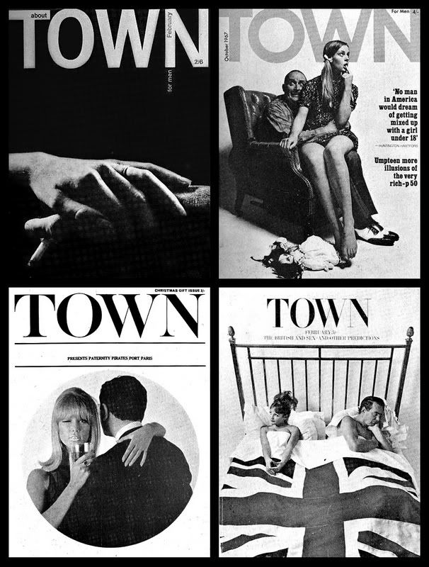
Publication: Man about Town (Shortened to Town in 1955)
Dates: 1952 -1968
Editor: John Taylor, Michael Heseltine & Clive Labovitch
Art Direction: Tom Wolsey, Roy Carruthers, Dennis Bailey, Ronald Schenk, John Donaldson
Photography: Frank Horvat, Donald Silverstein, James Mortimer
Man about Town started as a trade magazine for men's clothes before being revamped into one of the first sophisticated monthly magazines for men. The 1961 feature spread; Leaders of the Tory Party (March 1961) is such an incredibly striking opener that I always remember this publication. I also particularly like the ever changing contents page. I would love to own some copies of this magazine as I think there is something quite special about it.
Labels:
Magazine Design,
Magazines,
Man about Town,
Town
7.24.2007
Guggenheim Magazine
Designed by Vignelli associates, this issue of the magazine dates back to winter 1994. The issue is almost entirely dedicated to 'The Italian Metamorphosis, 1943-1968' exhibition. The magazine looks at the way in which Italy reconstructed itself after the Fascist regime through art, glass and ceramics, jewelry, photography etc.
The first section of the magazine looks at some of the objects in the exhibitions followed by 3 essays and then a Q&A on the Japanese exhibition which is being held at the same time.
As you would expect form any object designed by Vignelli it is elegant, well considered and of course timeless.
7.23.2007
French Graphic Design
Title: The Story of Graphic Design in France
Author: Michel Wlassikoff
Publisher: Gingko Press, Inc (28 Feb 2006)
ISBN-10: 158423220X
This book was featured in EYE61 a while back. This citroën work by Agence Delpire really caught my eye. It's an expanded re drawn form of Carousel which is almost so wide it's unreadable, making it seem very luxurious and decadent. The book has a wealth of work in it which is worth an indepth look.
7.19.2007
Le Temps
Publication: Le Temps
Editor: Jean-Jacques Roth
Design: Esterson Associates, Jon Hill & Micha Weidmann
Le Temps is a leading French-language newspaper in Switzerland based in Geneva and was redesigned by the studio in early 2005. As well as the main paper, the paper's weekly listings section, Saturday scultureal section and special magazine were also redesigned.
Labels:
Editorial Design,
Le Temps,
Newspaper Design,
Studio work
7.17.2007
7.13.2007
David's second outing with the Holga
Photographs taken at the Goodwood Festival of Speed 2007.
The Festival is motor racing's equivalent of Ascot or Wimbledon: an extravaganza of sound and colour that has been described as 'the garden party of the Gods'.
James Hunt's Marlboro McLaren M23 – 1973
Jackie Stewart's Elf Tyrrell 006 – 1974
Austin/Morris Mini Cooper 'S' Works – 1963
7.10.2007
Erwin Pœll
Title: n+m
Editor: Hoimar von Ditfurth
Year: 1965-1972
Publisher: Boehringer Pharmaceutical Company
Art Director: Erwin Pœll
Back by popular demand, some more covers of the beautful Naturwissenschaft und Medizin (Natural Science and Medicine) designed by Erwin Pœll in the 60/70s. Who knows what complex scientific theorum they illustrate, they just look beautiful. Pœll produced many scientific text books, each with incredible covers and indepth diagrams. The most comprehensive guide to his work is found in his book.
Title: Entwürfe für den Alltag. Typografie, Grafik-Design, Art Direction
Author: Erwin Pœll
Year: 1992
Publisher: Birkhäuser Verlag Basel
ISBN: 3-7643-2758-8
Here are a few images...
7.09.2007
Heath Robinson
Robinson was an English cartoonist and illustrator, best known for the complicated and outlandish inventions he portrayed. 'The Sketch' and 'The Tatler' regularly published his work and his cartoons of crazy inventions soon captured the public imagination. Essentially he was caricaturing the age of the machine and the self-importance of some of the people caught up in that age - creating complex inventions that achieved absurdly simple results, while the audience looked on solemnly.
7.05.2007
Branding
Title: Design Concept Realisation
Author: Wolfgang Schmittel
Publisher: ABC Verlag. Zürich
Year: 1975
ISBN: 3-85504-038-9
Take six brands: Braun, Citroën, Herman Miller, Olivetti, Sony + Swiss Air and study all their brand communication. A Gem from 1975 with some great work in it. Here are a few Braun elements. I find it hard to draw a parallel with the Braun identity of today, but something tells me that if the work was as minimal as it was in 1975, it would seem like a much more luxury brand.
Vitra catalogue
Client: Vitra
Design & Art Direction: Cornel Windlin
For any of you who missed the hype, Cornel Windlin gave new meaning to what catalogues could be in 2005. I could give you a full description of how fantastically inventive it is and its significance to the genre, but Rick Poynor has already done that in issue 56 of eye magazine.
7.04.2007
Ornamental Letters
Homage to the mighty 19th century lithographer, Karl Klimsch who has been the author behind many Dover Book publications. Here is an intrictae letters: I & E
Labels:
Dover Books,
Ornament,
Type Specimens,
Typography
Subscribe to:
Posts (Atom)