12.28.2010

Wrapping up 2010


A few random things from the archive that we like to look at

8.09.2010

Contemporary British Printmakers


A great book cover using simple geometric shapes

7.27.2010

Filmkonst


Cover of Swedish Magazine: Filmkonst March 1998

7.21.2010

Faber & Faber


Book: Faber and Faber: Eighty Years of Book Cover Design
Author: Joseph Connolly
Publisher: Faber and Faber
Year: 2009

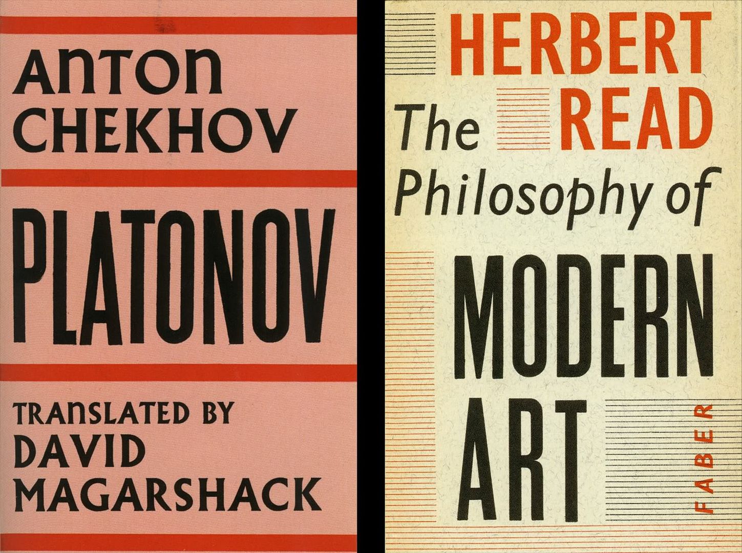
Back to the all type cover. Sometimes simplicity is missing these days. Although the above examples might not be your classic Faber & Faber book cover, they are a surprising delight. The book has a huge variety of cover designs in it from which we showcased a selection of all type covers that just caught our eye here at Things to Look At.

6.21.2010

Andrzej Klimowski


Stumbled across these gorgeous covers by Andrzej Klimowski for the republished works of P.G. Wodehouse.
A great marriage of typographic style and illustration.


Publisher: Everyman's Library

5.29.2010

The New Yorker


We've just realised that we've never put up a blog post on The New Yorker!
Never talked about how enjoyable it is to read 5 straight pages of solid 3 column type, its fantastic cartoon's, the pleasure of walking around with it.
Hopefully you're all aware of it. Just for indulgence though, here are some covers from their fantastic archive going all the way back to 1925.


3.11.2010

Giles Balne


Giles Balne, Printer, 1777, was in a great position. He printed lottery tickets, then won the jackpot, then bought the Vauxhall Gardens, then spent the rest of his days printing amazing posters for them. This poster is 780 x 532mm and is one of seven kept at the Bodleian Library in the John Johnson collection in Oxford. Well worth a visit to see the real thing.

2.25.2010

ipad EDO lecture


Next Wednesday (March 3rd) heralds the first EDO lecture of the year titled: What’s on your iPad? Rather than continue the talk about technology and the intricacies of how your amazing new futureproof app works, it seems it's more about content (The King) and how it works with the print dinosaur weeping in the background behind it. Are Newspapers the littlest hobo moving on from their print past towards a bright shiny new digital future, where everyones' laps, ears and hands are warmed by their plethora of devices? or do they see some kind of rose-tinted synergy between the two? Or will they enthuse us with phrases such as a 'paradigm shift in interactivity' as we heard someone utter with a straight face the other day.

Here at Things to look at, we feel all these lofty words should be set into a Star Wars introesque paragraph of glowing blue text which slowly disappears into the grand star-studded chasm of the swirly black universe of possibilities, but this is probably because we know nothing about our intergalactic future and feel we couldn't possibly read more than 120 characters on a computer screen before we forgot how to read and our eyeballs fell out. So we thought we might as well go along and see what the future looks like before we rush out and buy the iPad that we know we will probably rush out and buy no matter what anyone says or produces for it.


We will report back in some highly interactive manner forthwith. But if you feel the need to join us then a few tickets are still available and representatives from The Times, Wired and Cosmopolitan could all be made to sweat under your penetrative questions. You can now book online.

In the meantime we thought you might like this great little site on console graphics.

1.04.2010

American Wood Type


A great typographic book cover to start the new year and a great book if you are interested in the history of wood type.

American Wood Type: 1828-1900 was written by Rob Roy Kelly and published in 1969 by Van Nostrand, Reinhold Company.